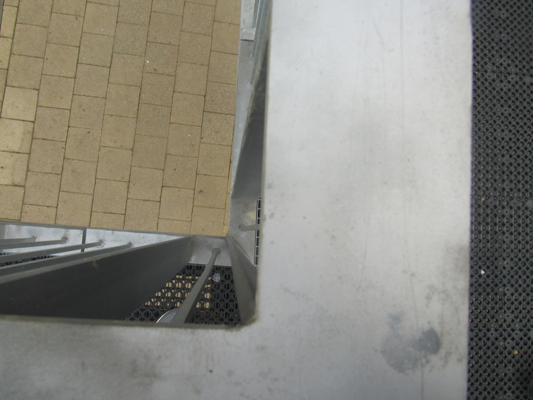
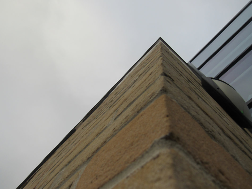
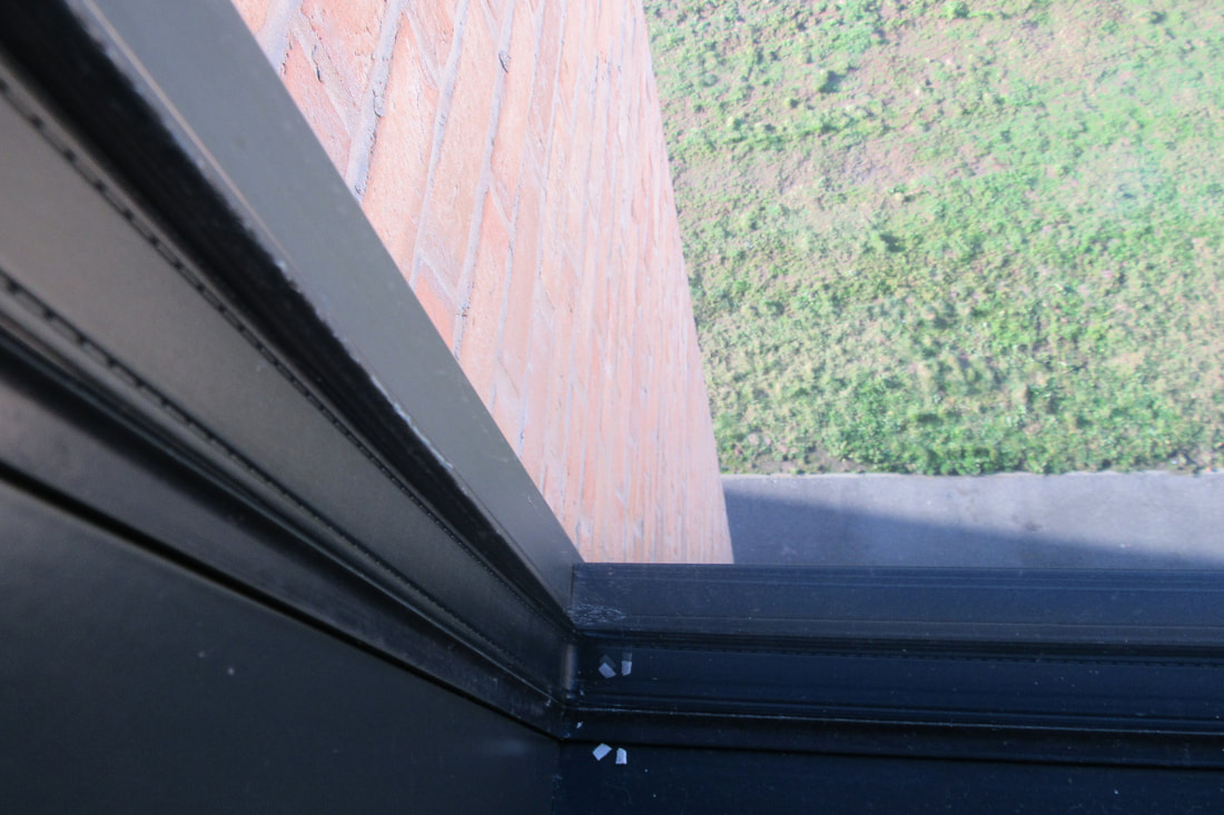
Edges
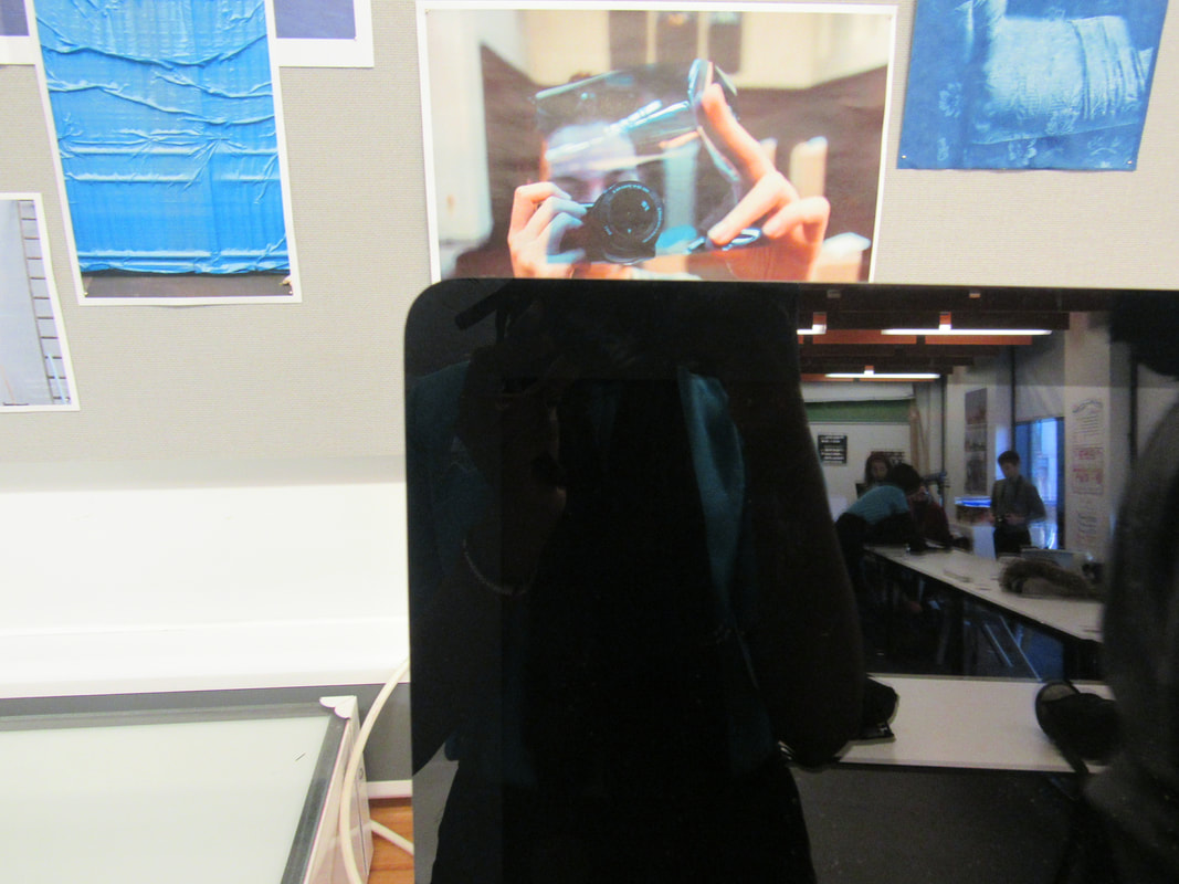
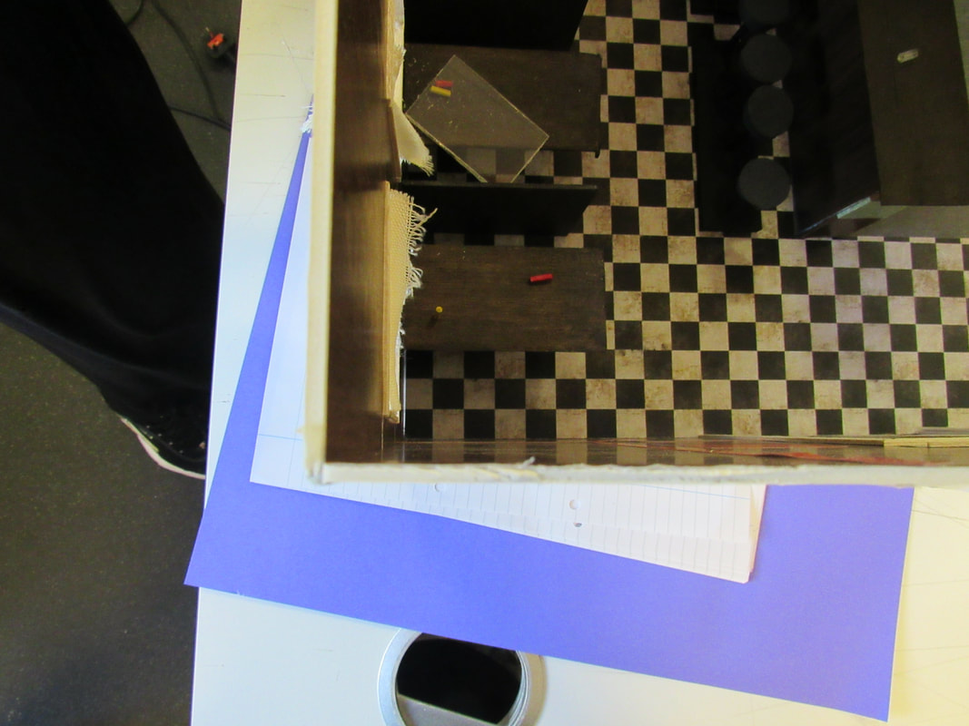
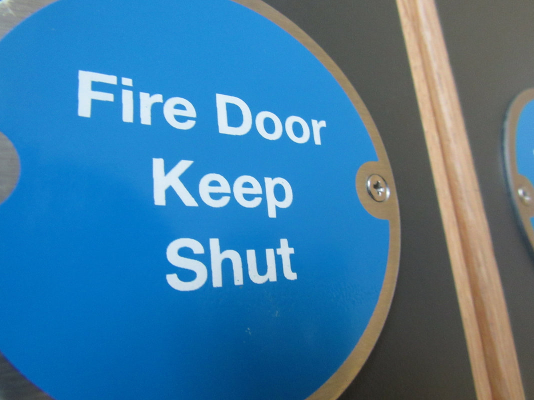
In today's lesson I went around the school and took photographs of edges. I used a mirror to help me take the photos. I mainly took photos of corners because i thought it was the most easy one to do for me.
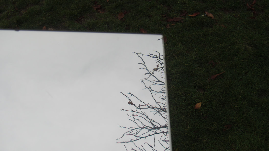
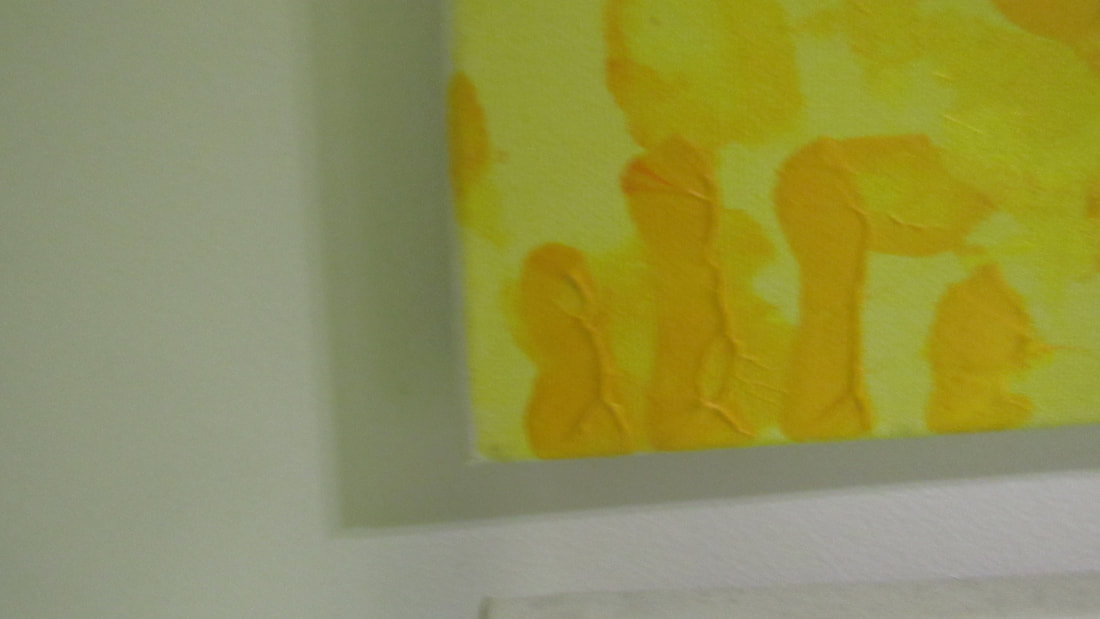
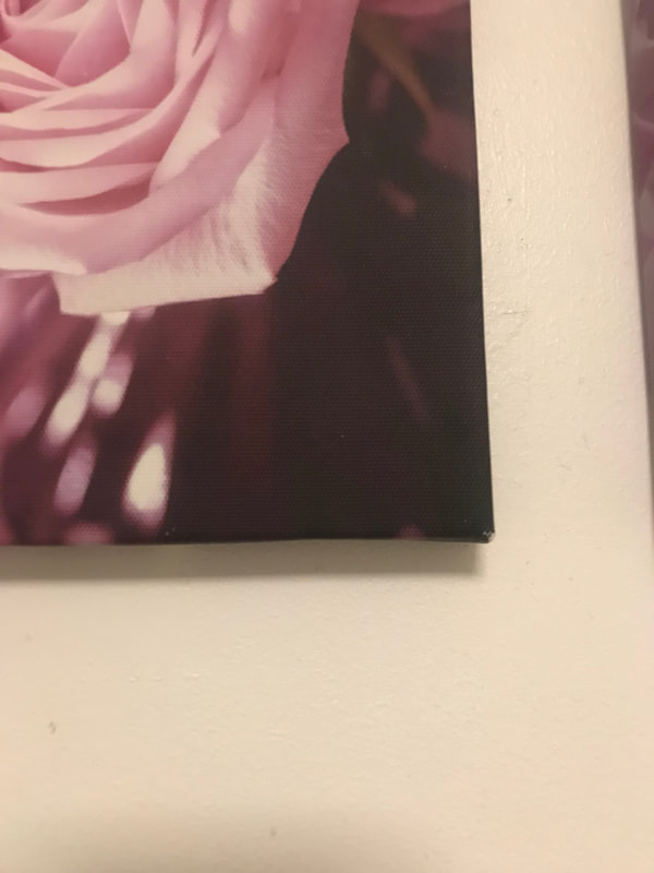
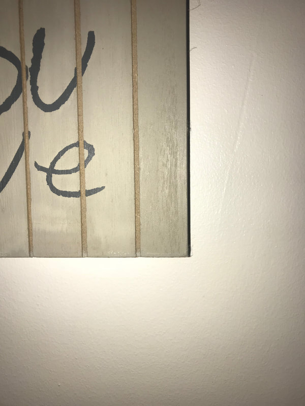
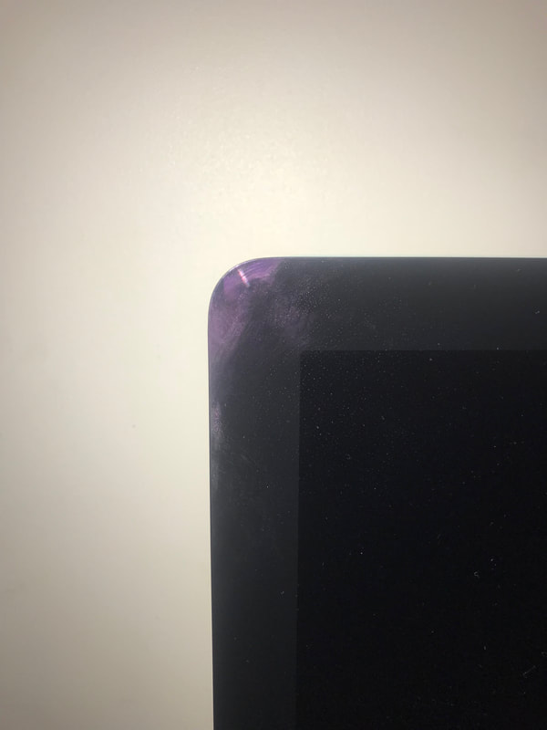
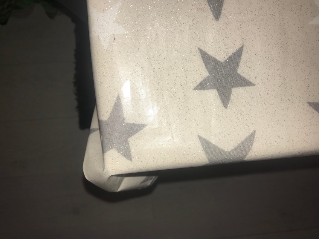
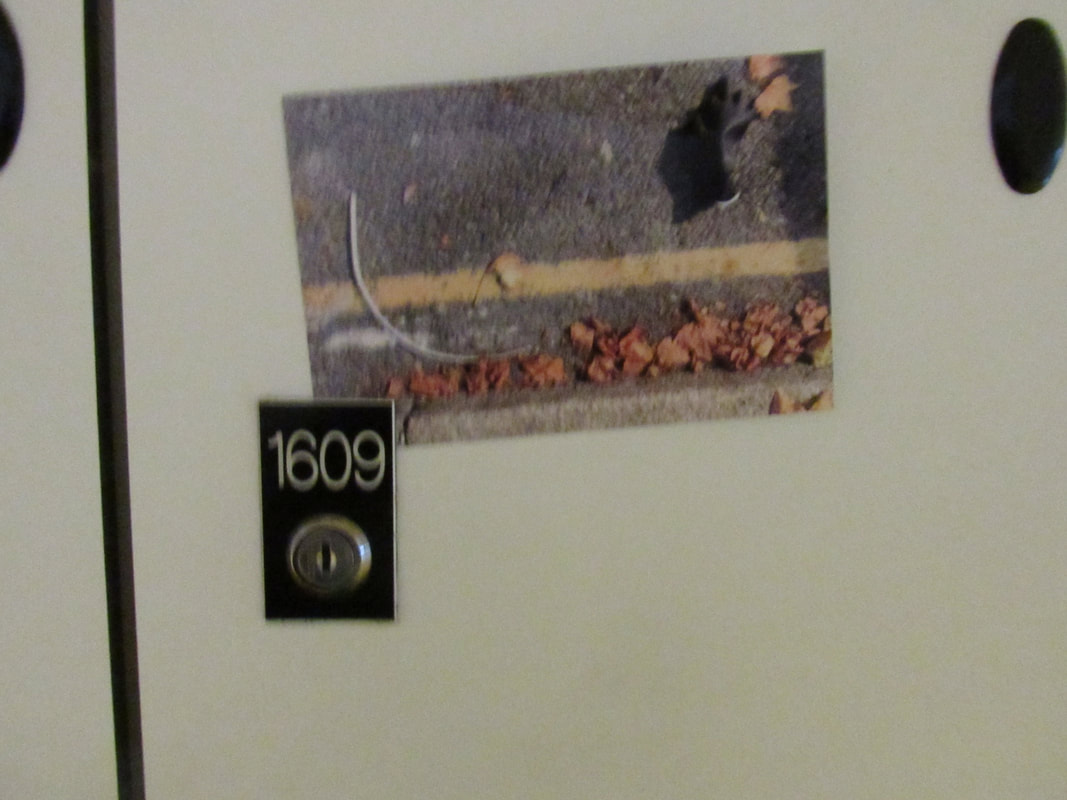
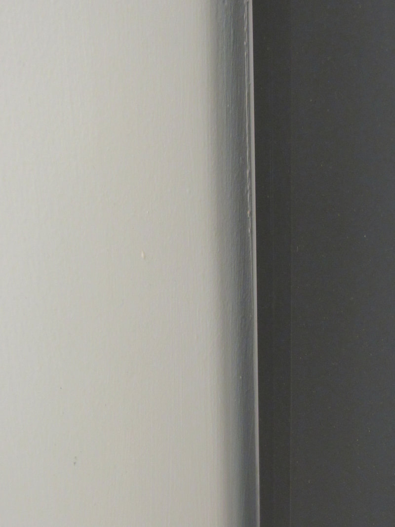
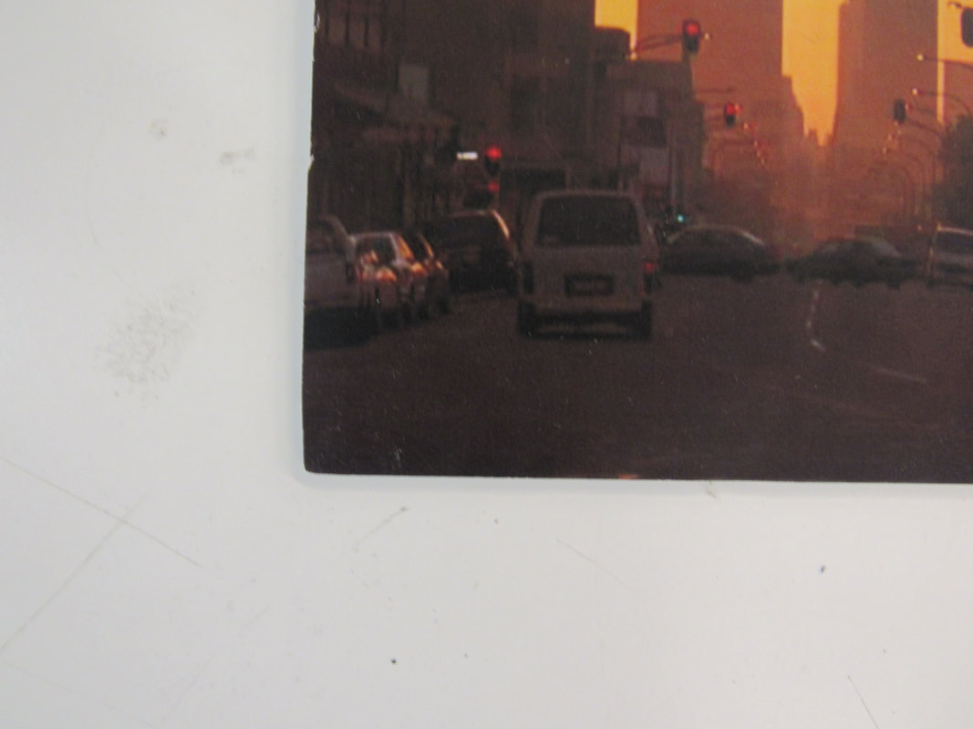
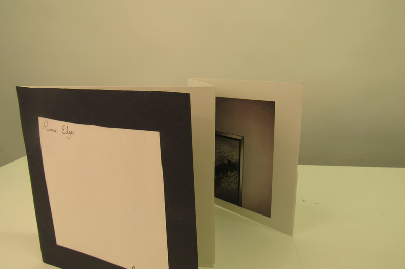
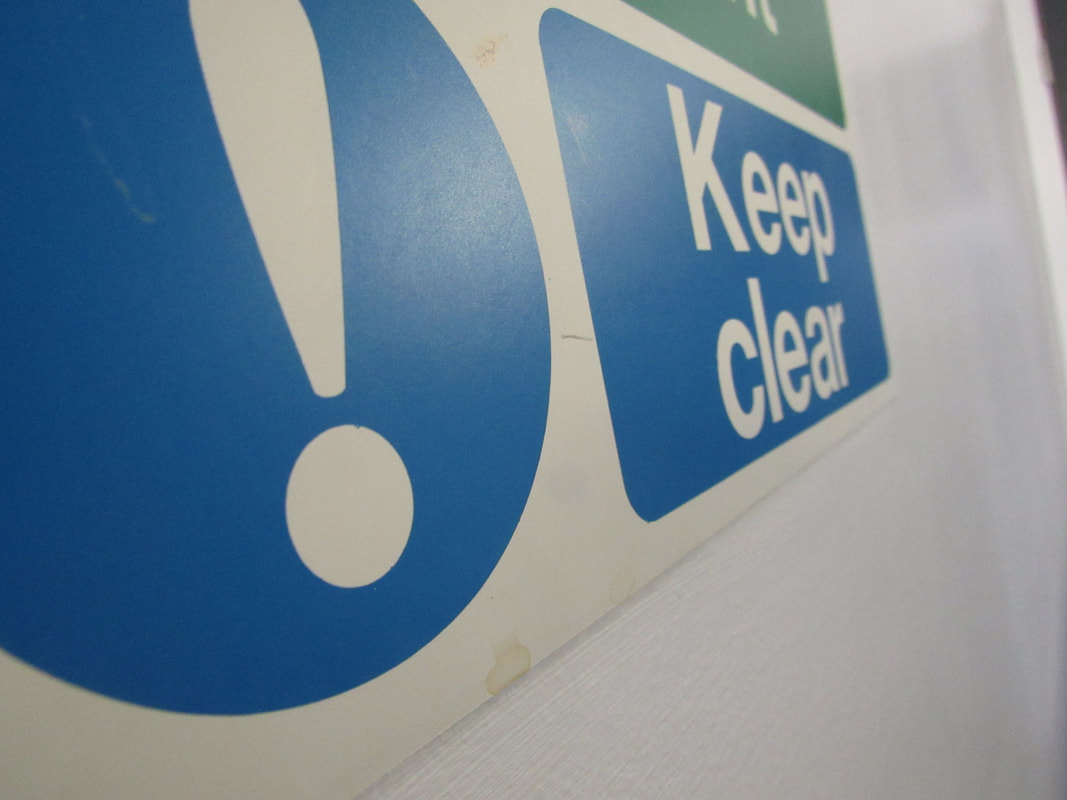
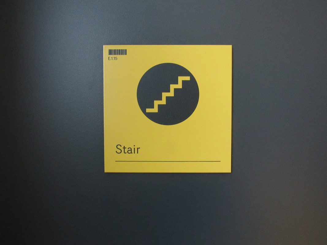
Home edges
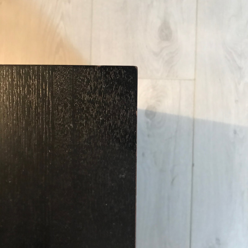
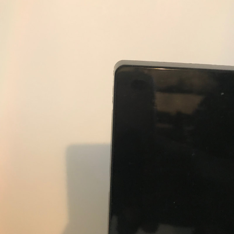
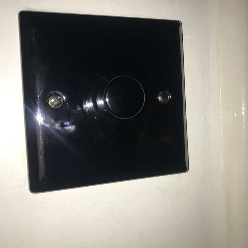
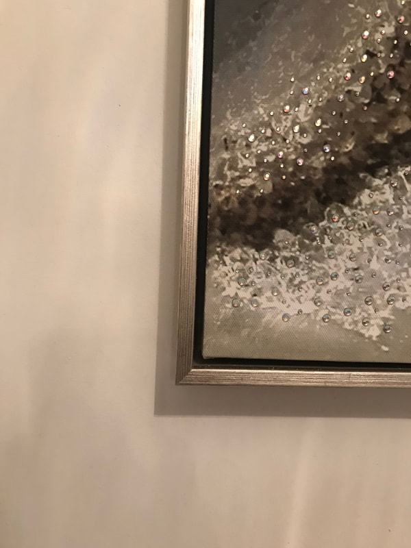
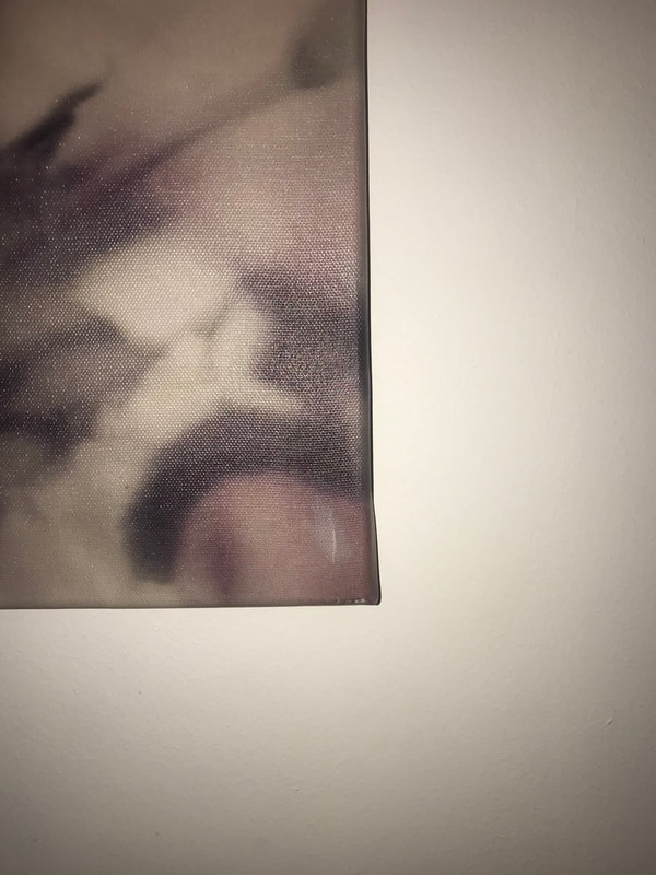
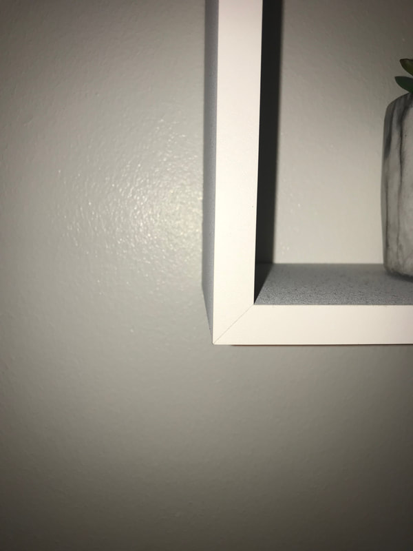
WWW:I found many different edges in different objects
EBI:It would have been better if i had more photos
EBI:It would have been better if i had more photos
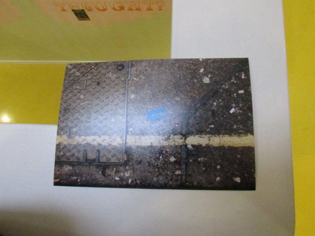
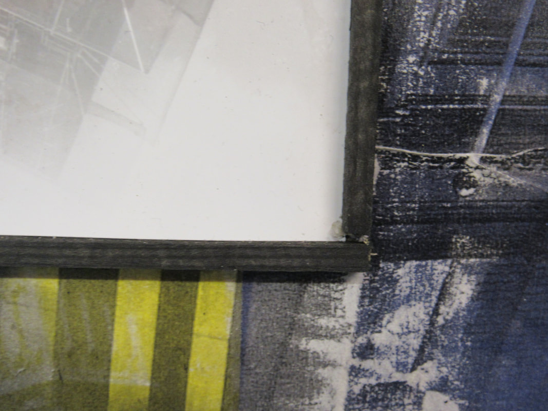
Paper edges
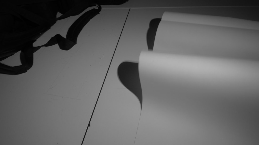
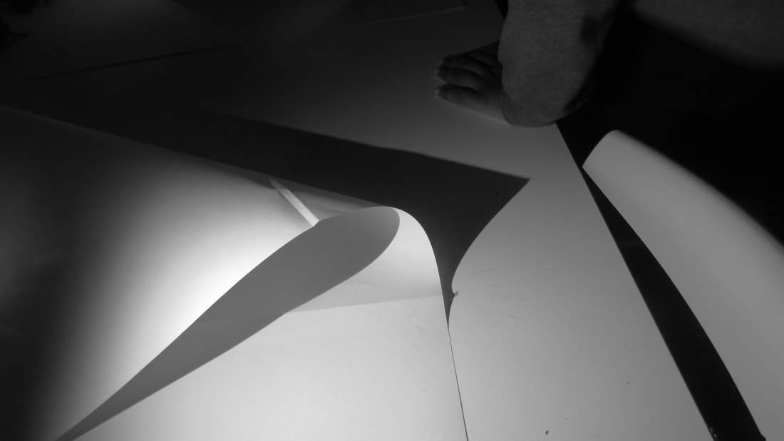
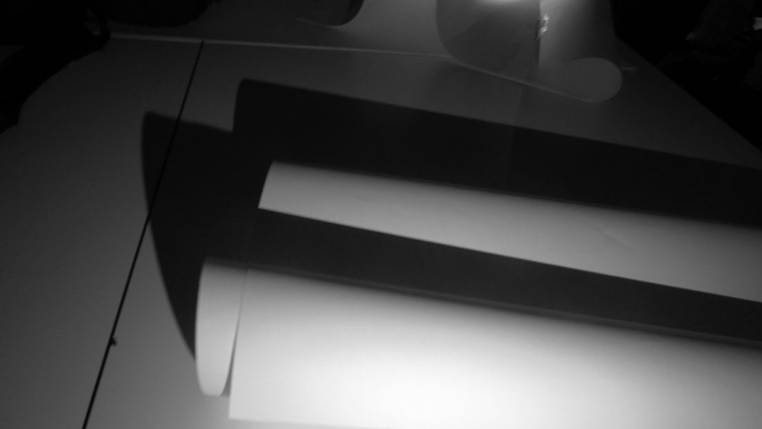
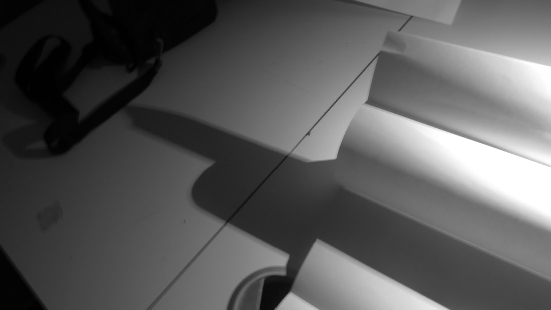
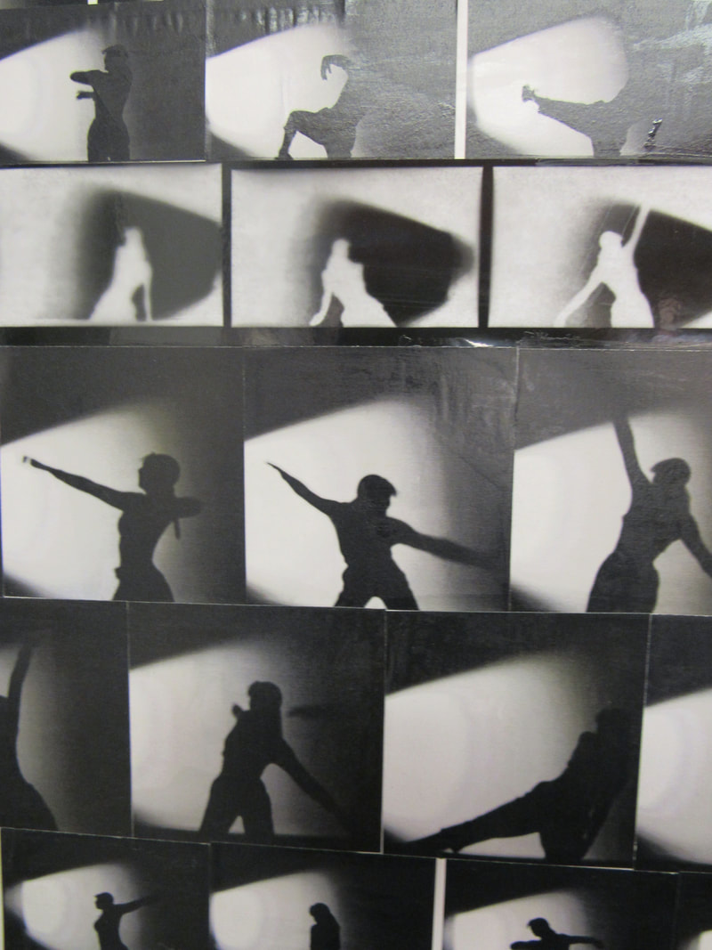
WWW: I have created different shadows by putting paper into different positions
EBI: It would have been better if I had made more sharp edges with the paper
EBI: It would have been better if I had made more sharp edges with the paper
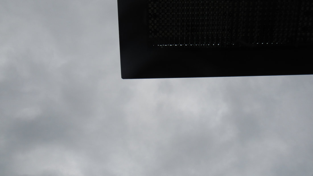
Up and down edges
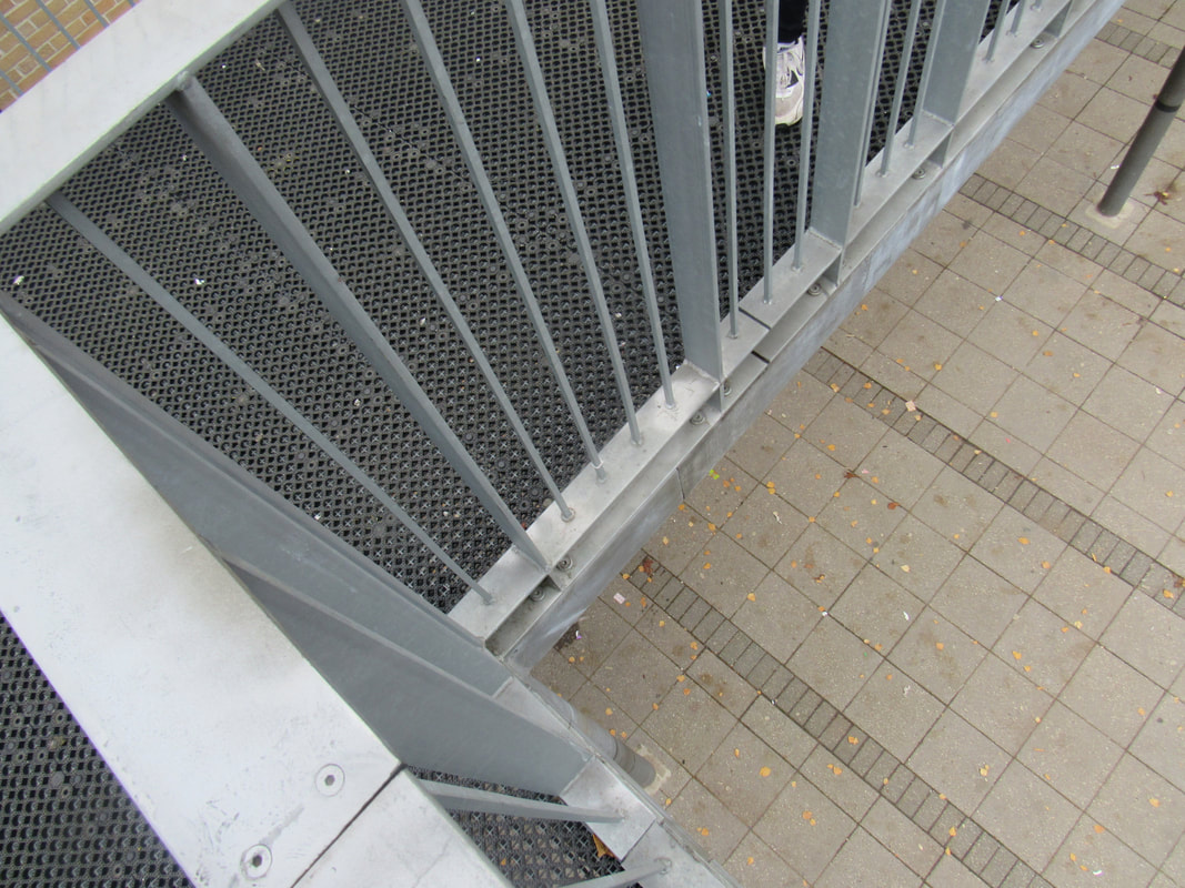
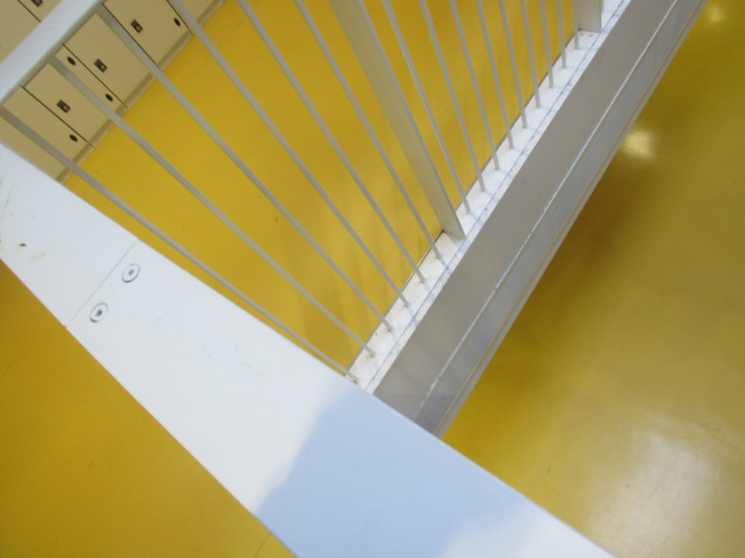
WWW: I have been able to photos of edges from a high and low perspective.
EBI:i had more varieties and creative pictures of up and down edges.
Edges Assessment
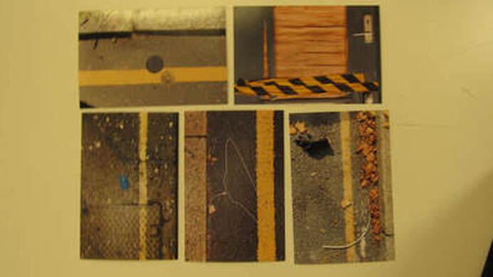
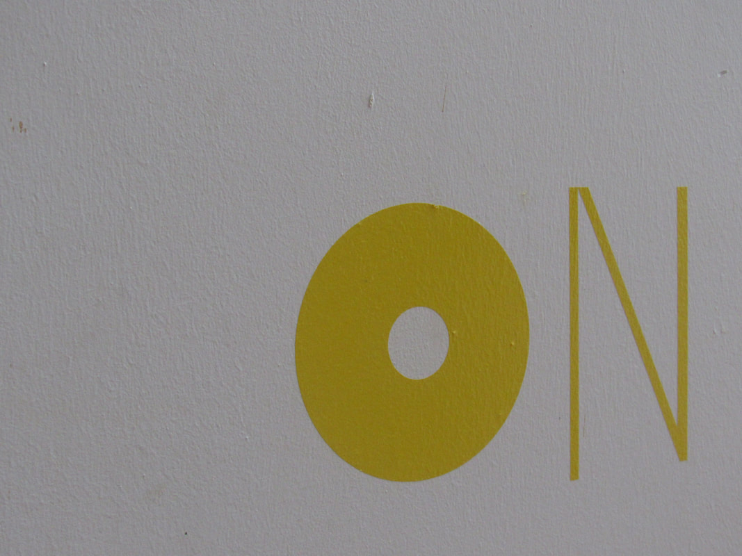
I have chosen these pictures because they are all similar with the yellow lines and they are all outdoor pictures. The main focus of these photos are they yellow lines because it stands out and they are all on the road apart from the back and yellow photograph.
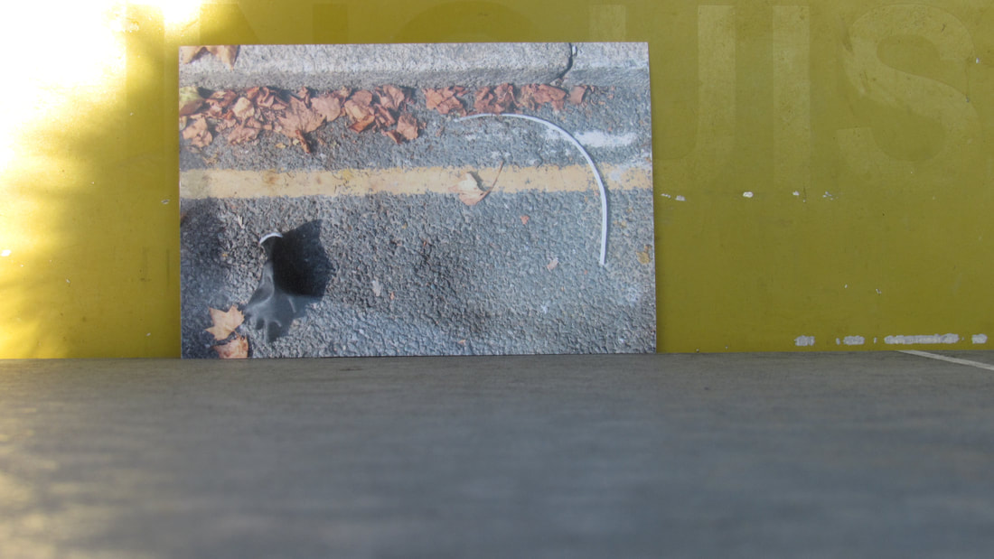
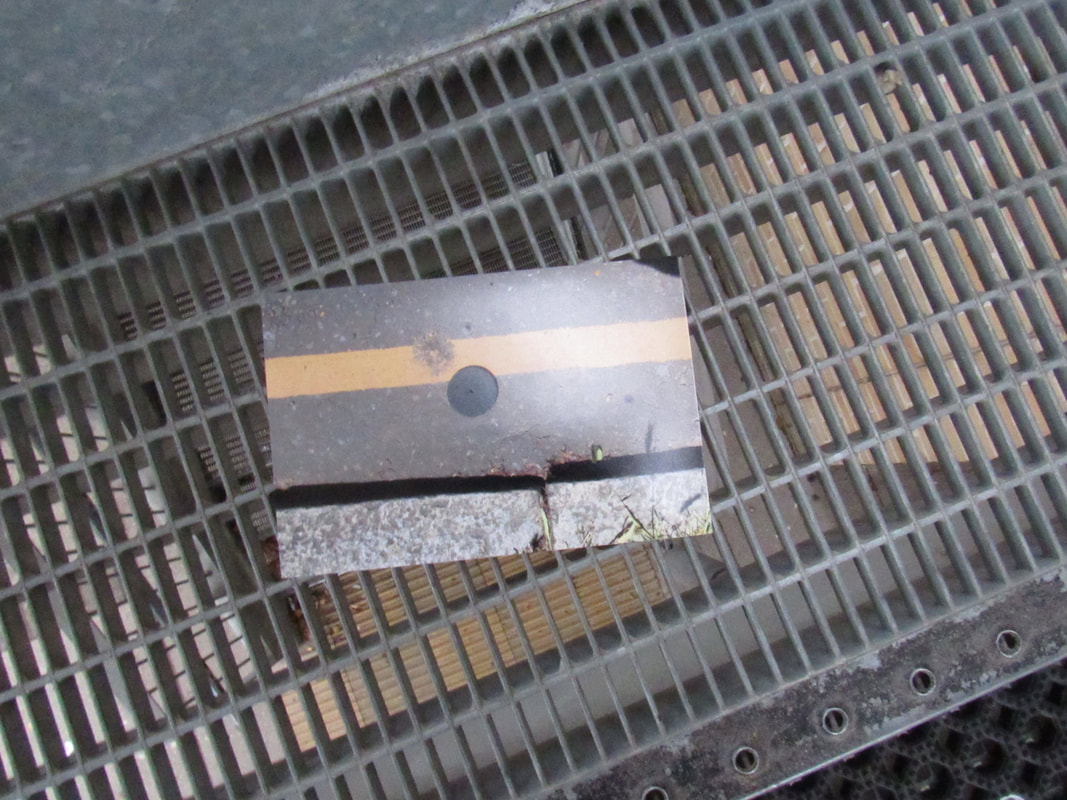
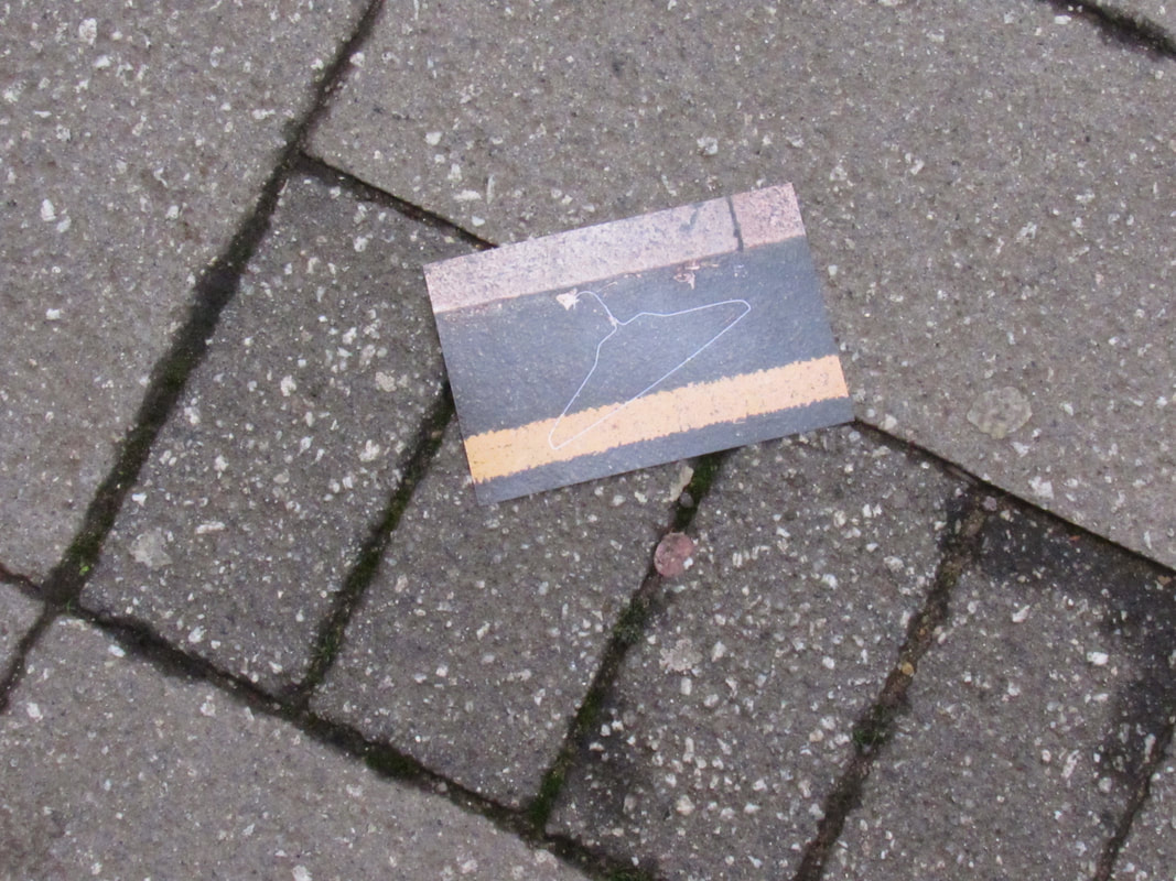
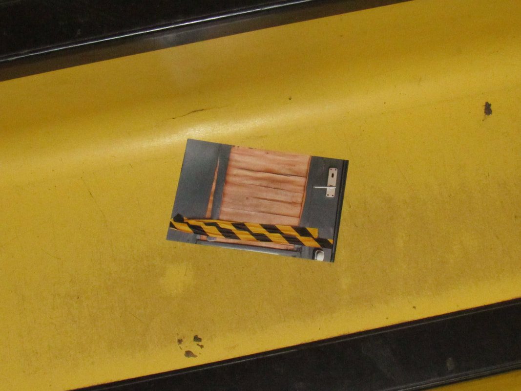
My photo sculpture
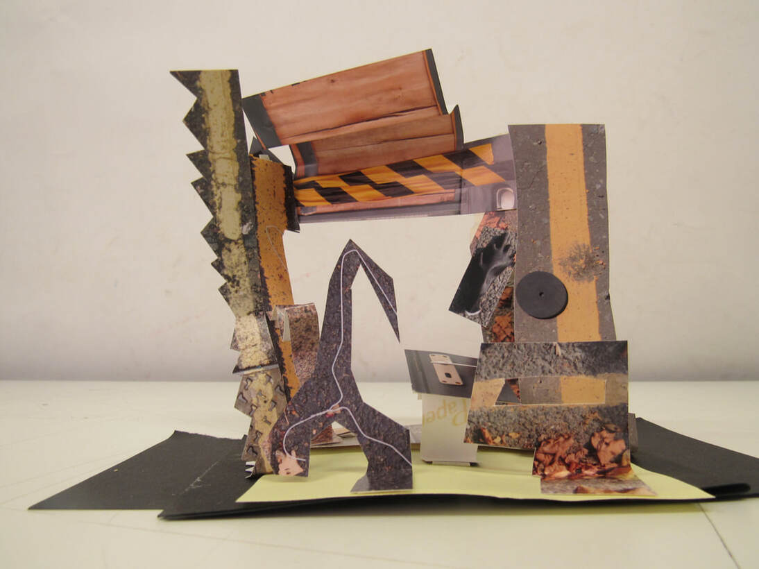
The theme of my sculpture is the yellow lines. what i think went well was the way that some of the pieces of my sculpture pop out. It would be even better if I had more creative photos. Some of the things I struggled with was trying to get the photos to stay up. I also struggled with trying to make my sculpture be interesting and different
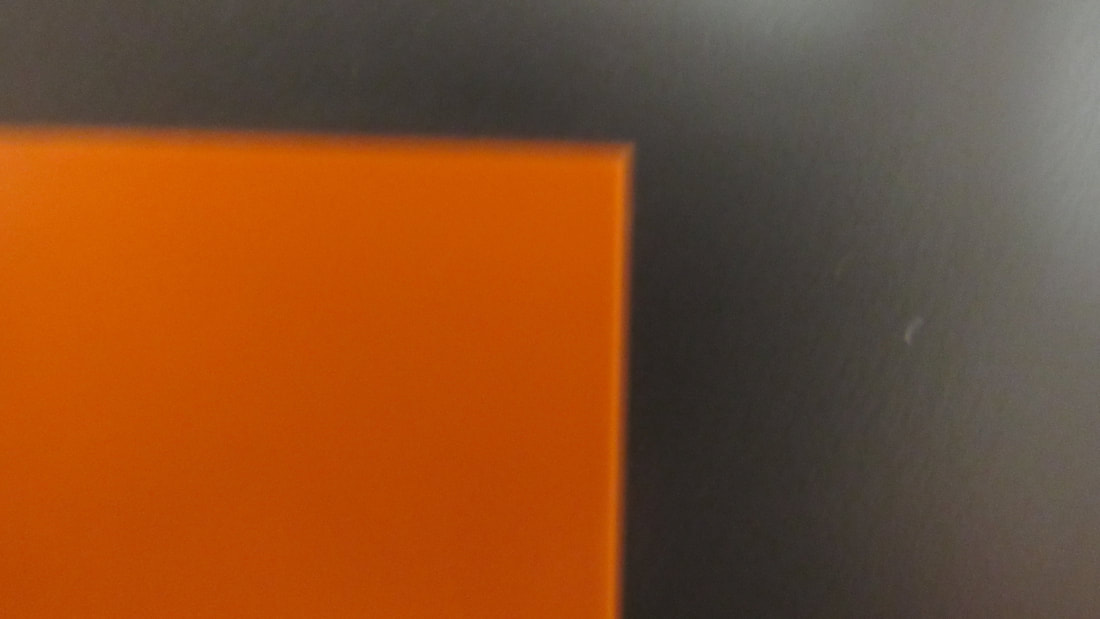
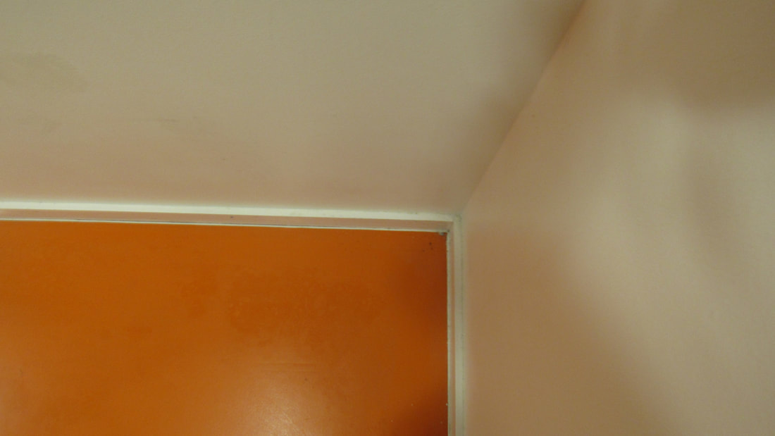
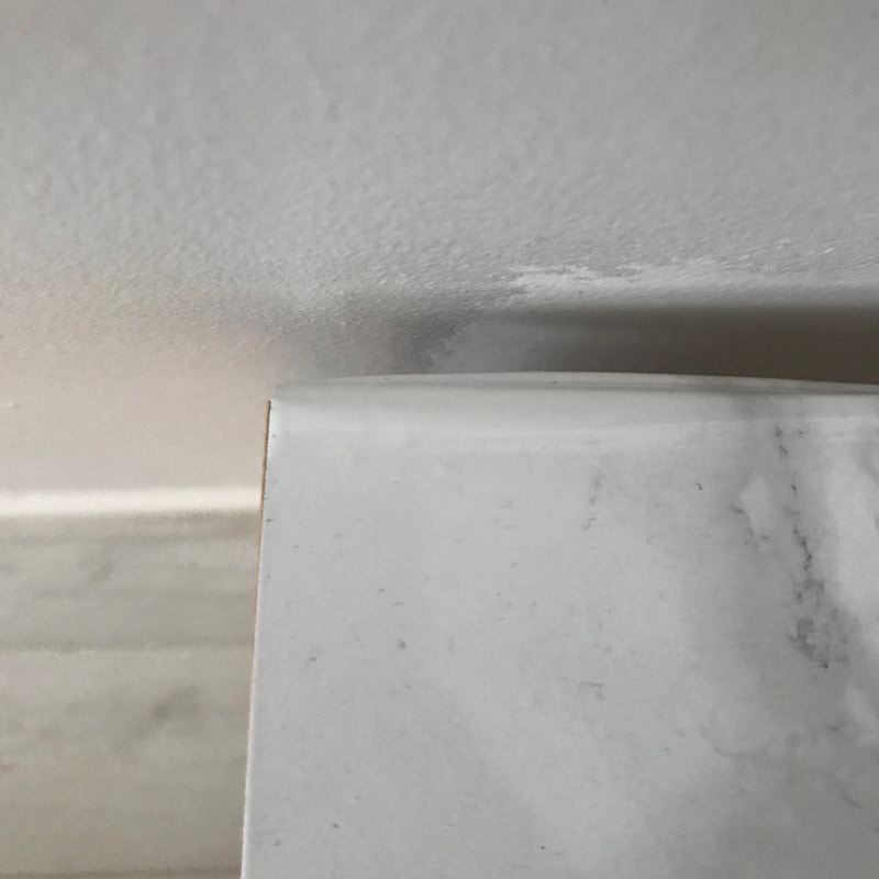
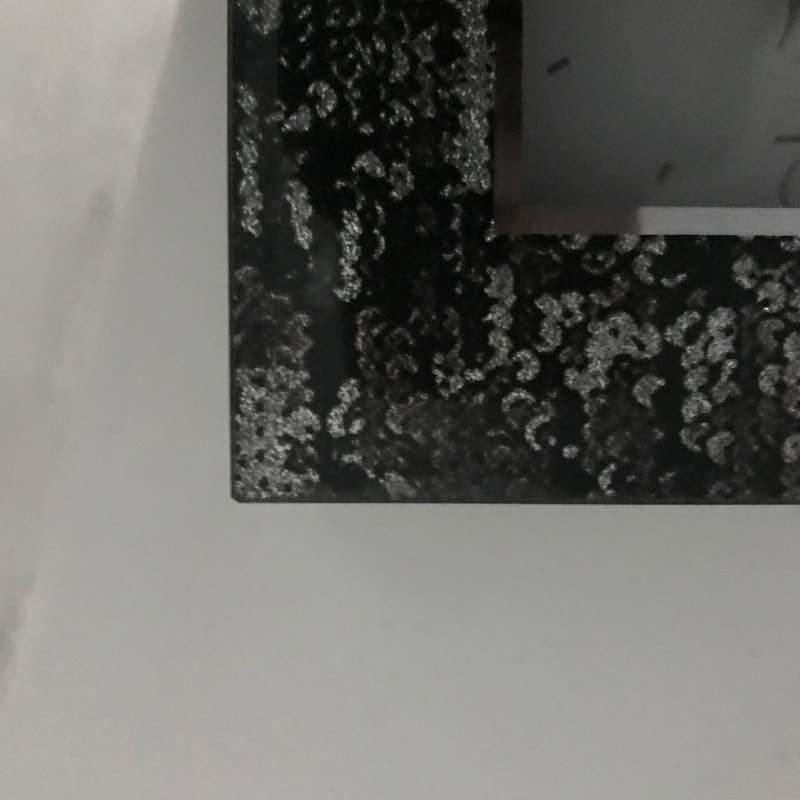
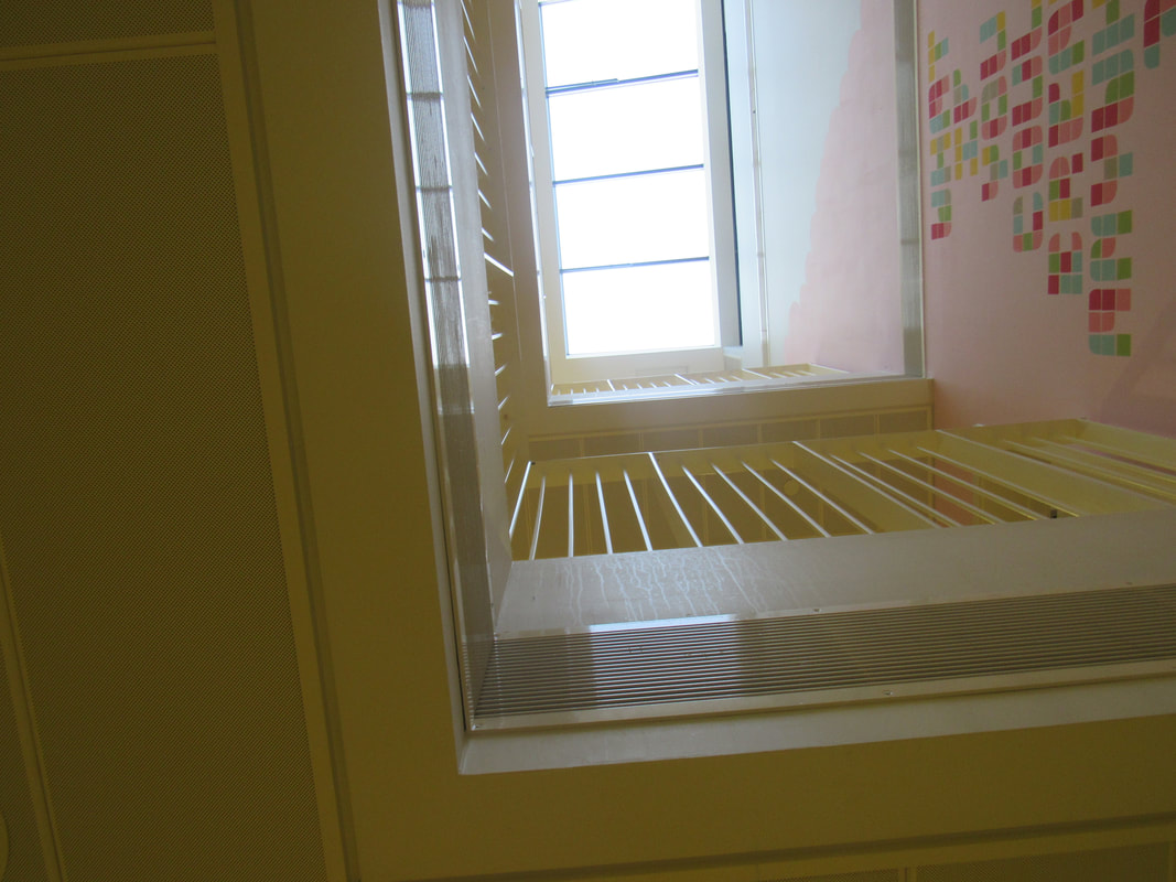
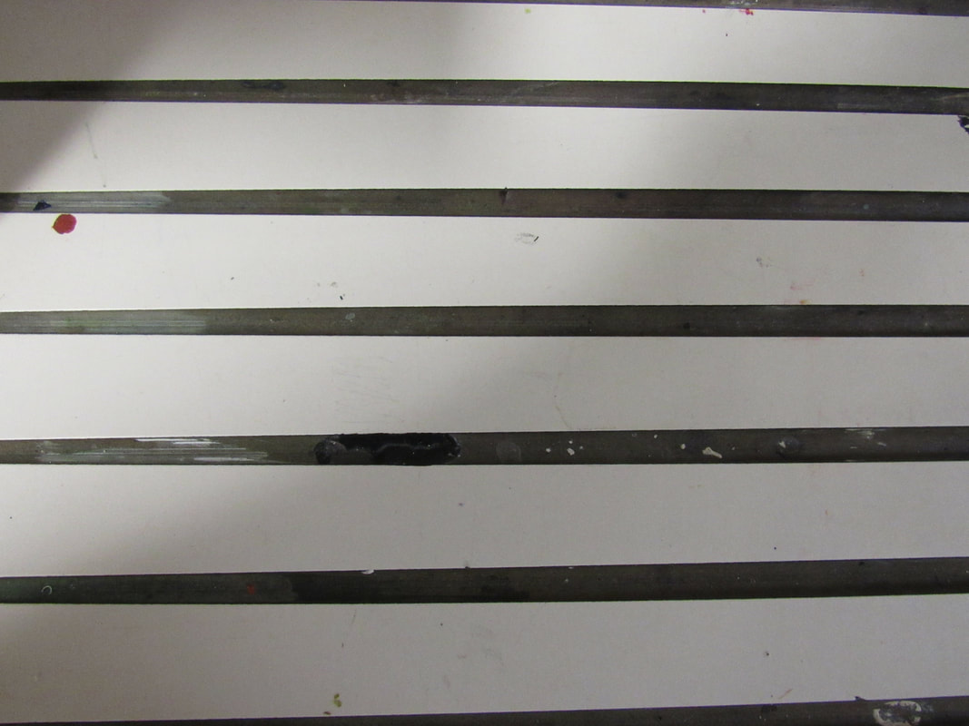
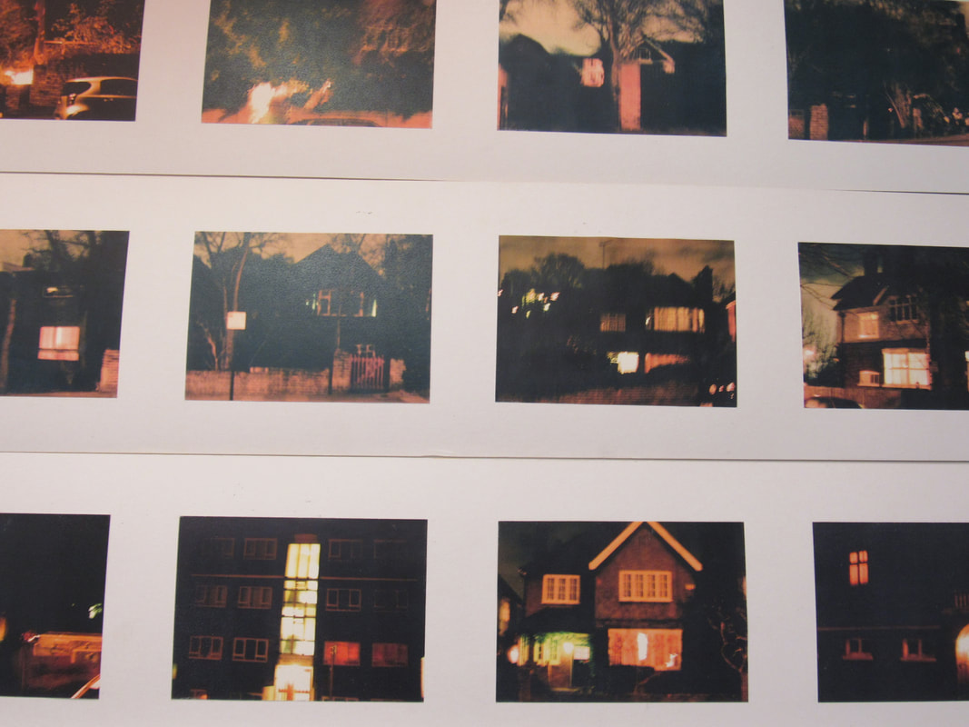
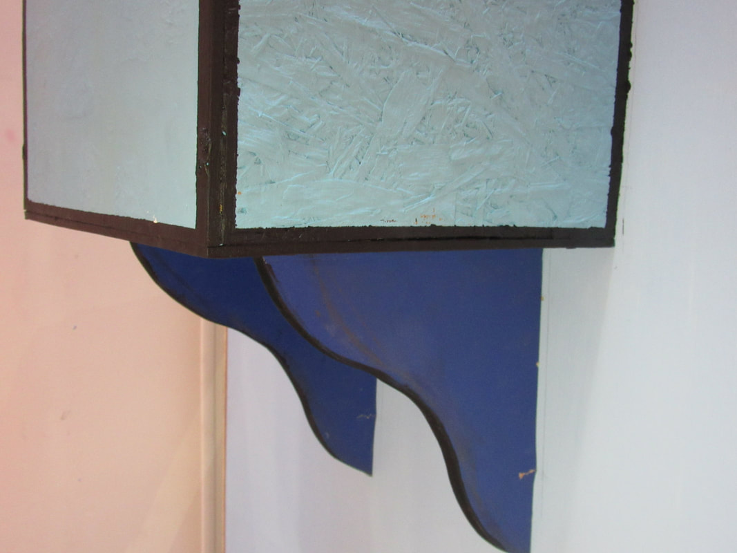
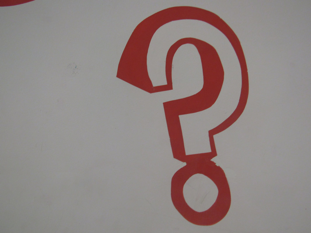
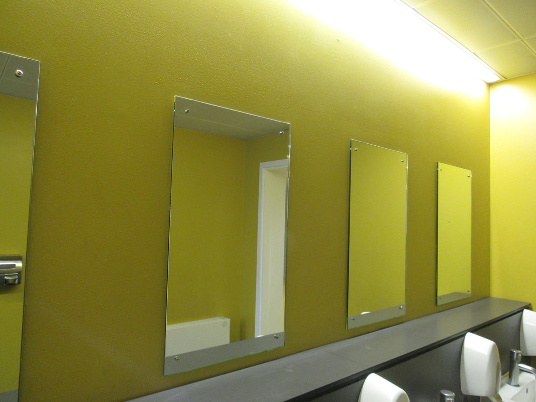
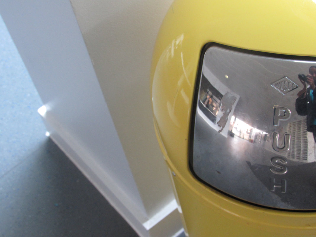
Edges around the classroom
For this lesson our task was to take photos with edges around the classroom
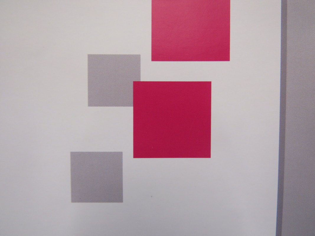
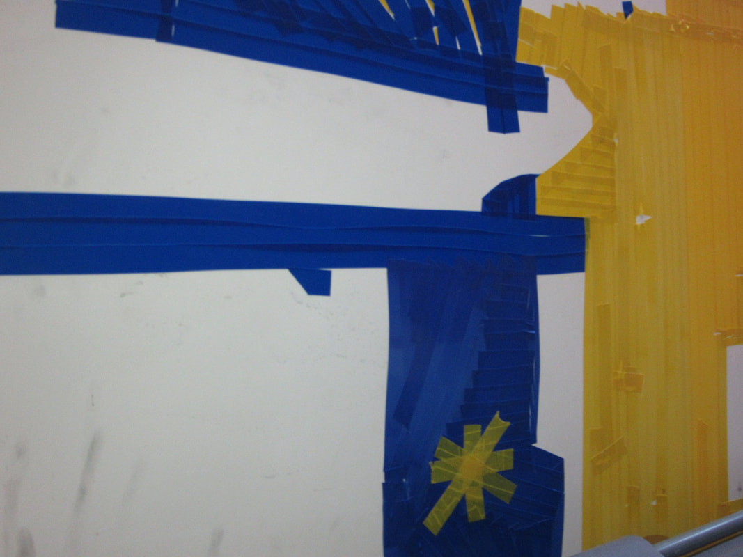
I am going try and find shapes arranged like this with very few colours or primary colours in it. I will also try to include many edges.
Piet Mondrian
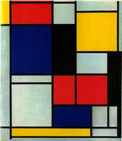
Piet Mondrian was a Dutch artist best known for his abstract paintings. Art that is abstract does not show things that are recognisable such as people, objects or landscapes. Instead artists use colours, shapes and textures to achieve their effect. This painting is similar to my photograph that I took because they are both very abstract and simple. In my personal project i am going to have primary colours like this painting.
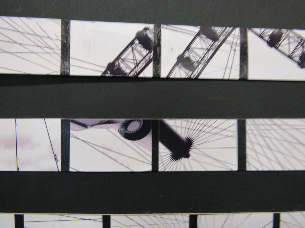
Triptych
What is a triptych in photography?
A photographic triptych is a common style used in modern commercial artwork. The photographs are usually arranged with a plain border between them. The work may consist of separate images that are variants on a theme, or may be one larger image split into three.
A photographic triptych is a common style used in modern commercial artwork. The photographs are usually arranged with a plain border between them. The work may consist of separate images that are variants on a theme, or may be one larger image split into three.
How do you create a triptych?
You get three photographs with the same themes arrange them horizontal or vertical place it onto a white border and it has to be separated.
You get three photographs with the same themes arrange them horizontal or vertical place it onto a white border and it has to be separated.
These triptych have a rectangle in the middle and there is nothing in the background.
Diptych
A diptychs similar to a triptych but only two related photographs are needed
In today's lesson was to create a diptychs. With my diptychs I decided that my photos would focus on simple squared objects which relates to my favourite photo I took in the classroom. What I think went well was sticking to my theme. I think I can improve by focusing on one colour only.
Concertina book
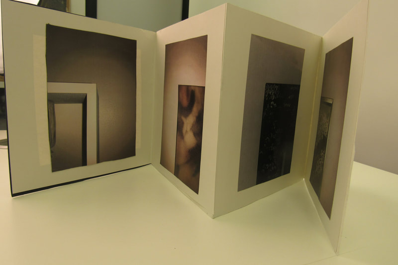
WWW: I had many photographs of edges.
EBI: To improve my conertina book I should have more triptychs and diptychs. I should also have a colour theme with my photographs next time.
EBI: To improve my conertina book I should have more triptychs and diptychs. I should also have a colour theme with my photographs next time.
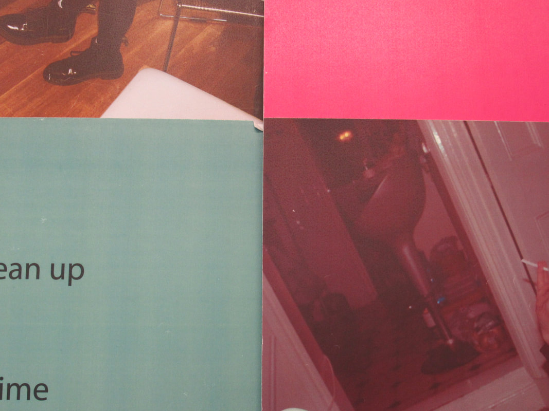
Edges comparison
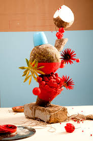
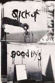
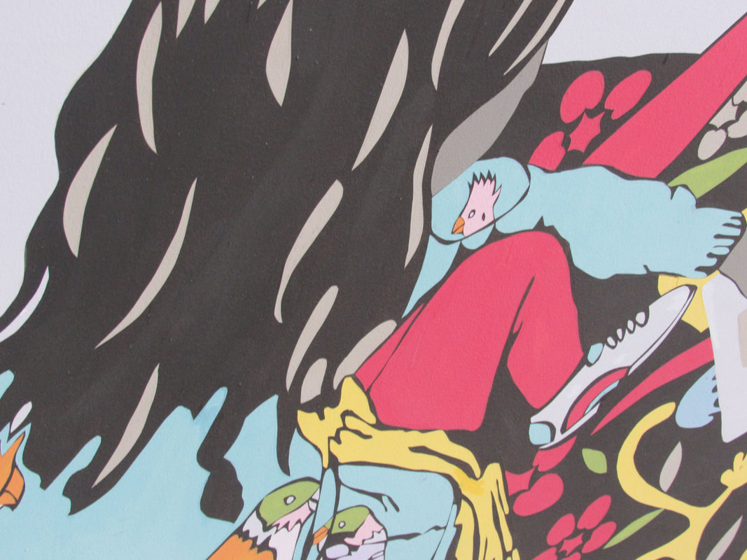
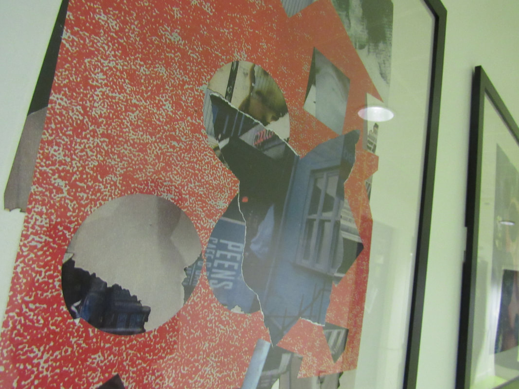
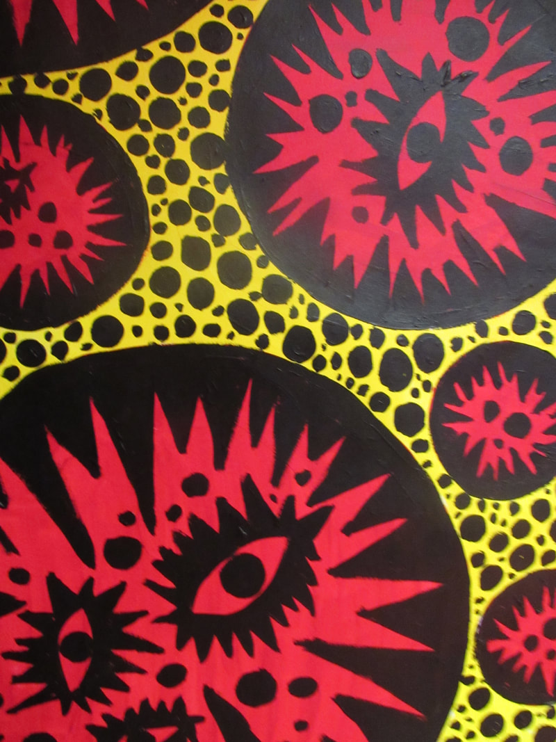
These pictures stand out to me because they are different and every unique because of the colours. The Sick of Goodbyes picture looks very old and weird looking. I think the aim of this picture is to make a person feel uncomfortable due to the weird writing on the wall. Overall it is a very creepy picture. The Red picture looks bright and colourful it seems inviting because of the bright orange and blue.
The differences between these pictures is that Sick of Goodbyes seems dark and dull. Red seems every vibrant and radiant. In the Sick of Goodbyes, the edges look really sharp and jagged in the second they look more smooth and bendy. Also the Sick of goodbyes has more edges and they are sharp but the second has more interesting things going on but with less sharp edges. There are no similarities between the two pictures.I think the Sick of Goodbyes explains a story but the Red is a bit more harder to understand.
The differences between these pictures is that Sick of Goodbyes seems dark and dull. Red seems every vibrant and radiant. In the Sick of Goodbyes, the edges look really sharp and jagged in the second they look more smooth and bendy. Also the Sick of goodbyes has more edges and they are sharp but the second has more interesting things going on but with less sharp edges. There are no similarities between the two pictures.I think the Sick of Goodbyes explains a story but the Red is a bit more harder to understand.
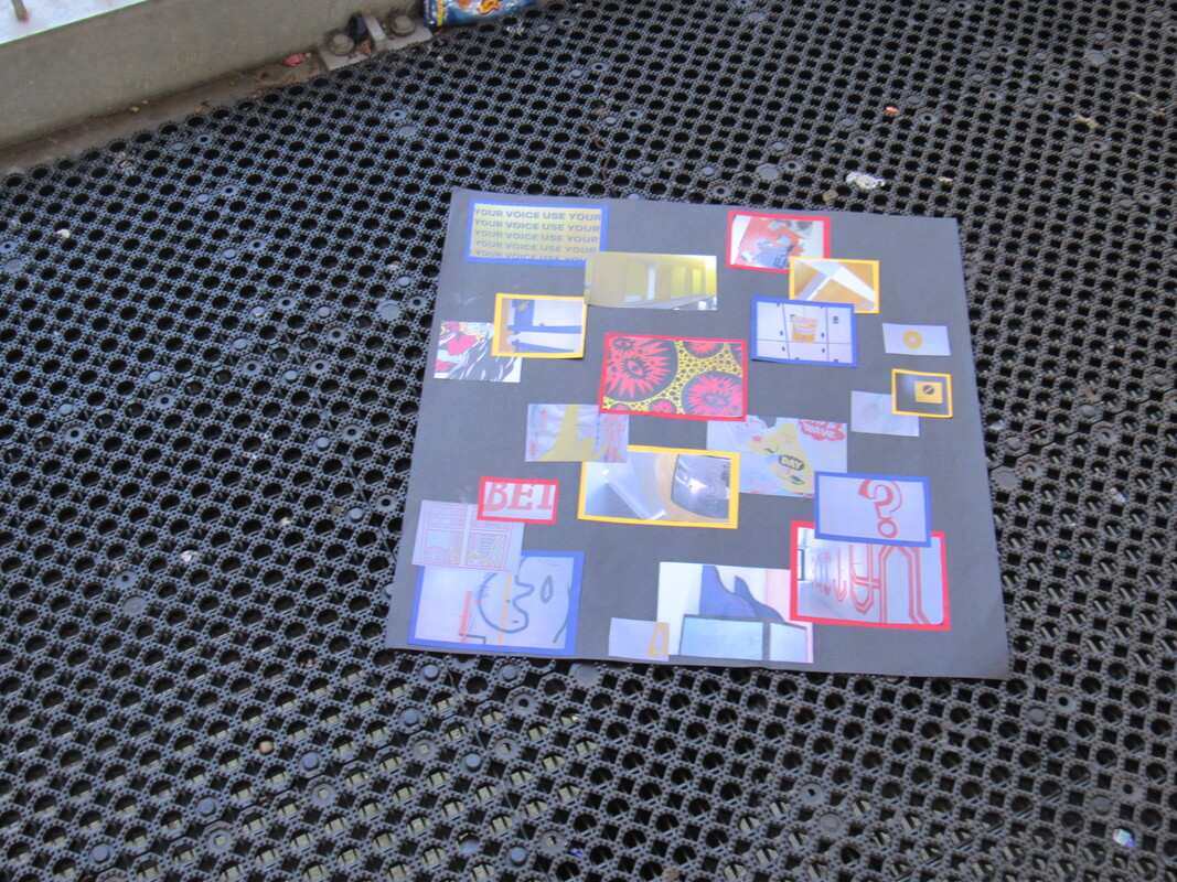
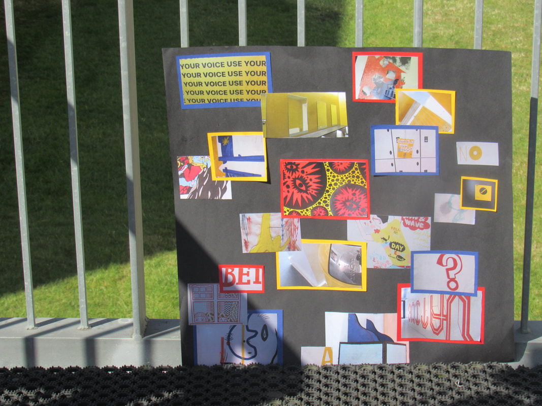
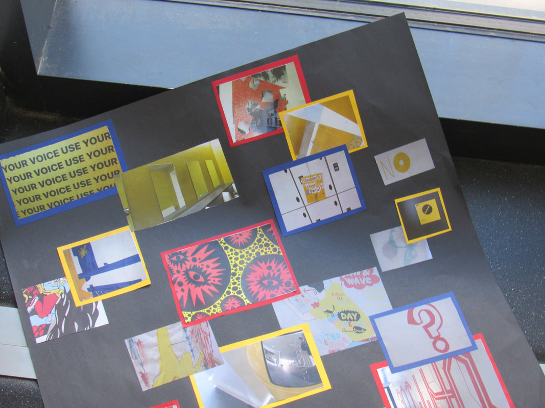
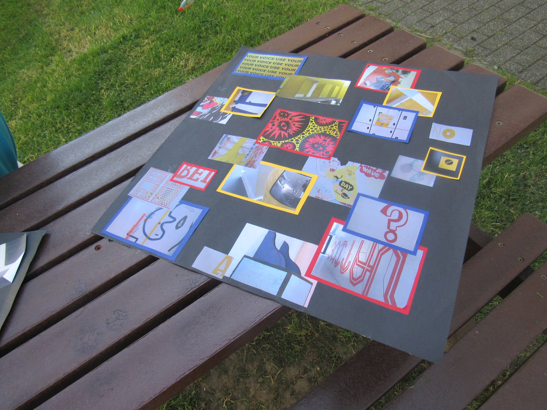
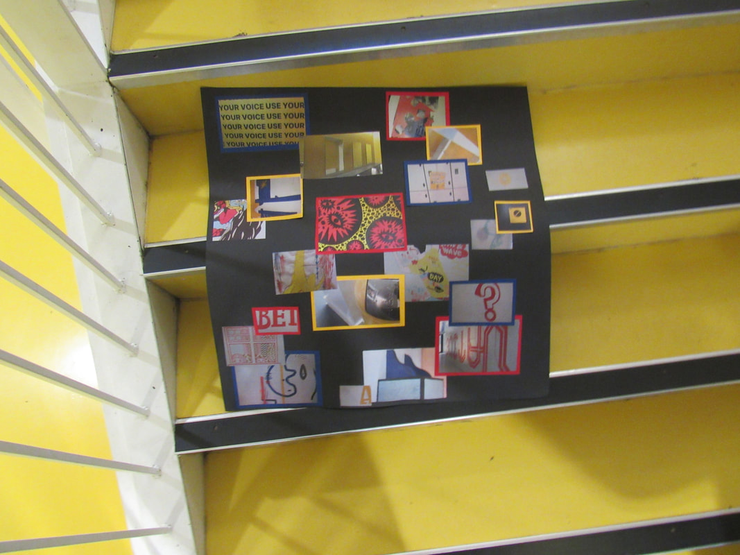
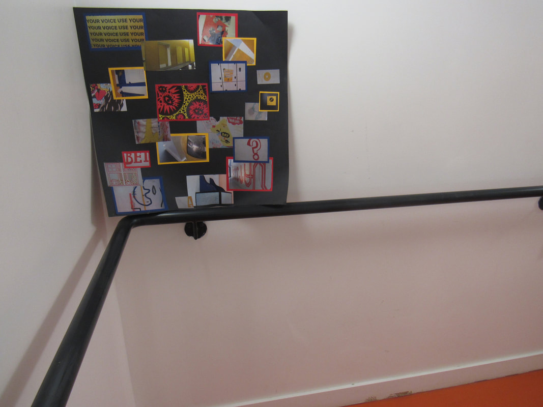
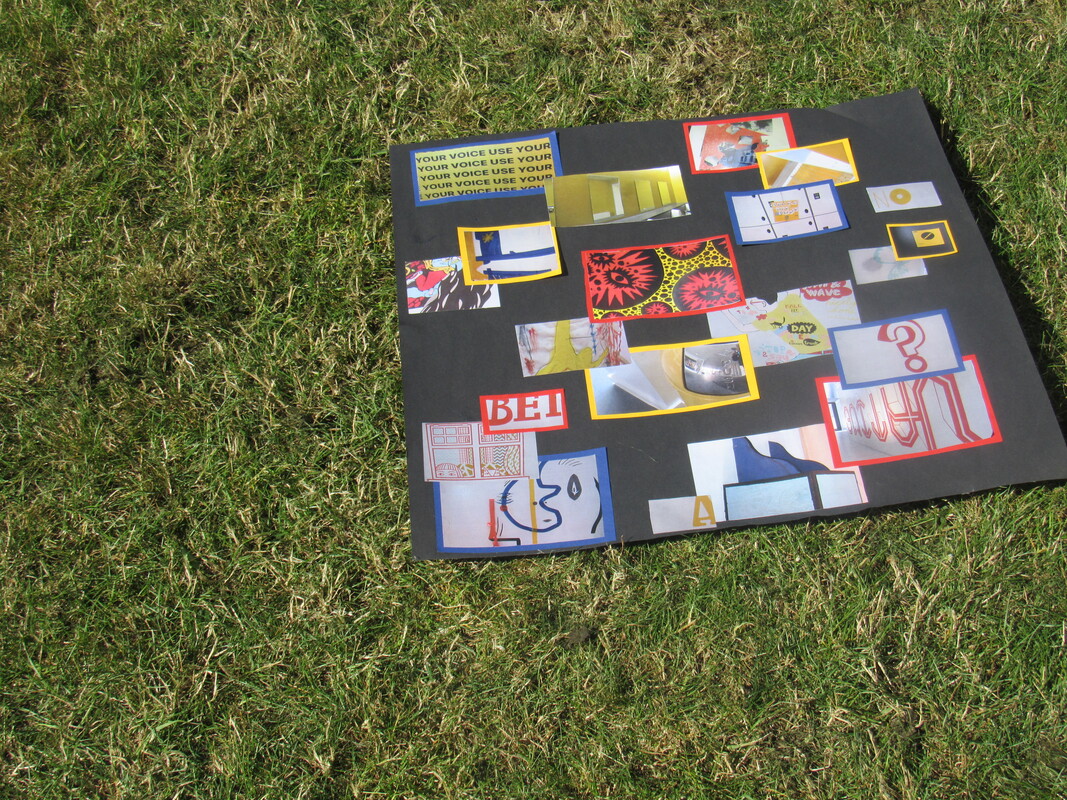
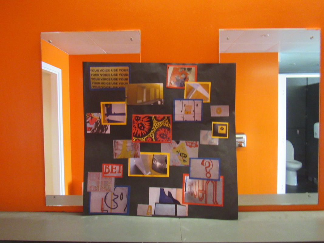
For today's lesson I went around the school and took pictures of objects that had primary colours, I had chosen primary colours because they are bold bright colours. For my personal project I decided to make a collage with objects that have the colours red, blue and yellow.
WWW: I stuck with my theme and I am happy with photos
EBI: I need my photos with blue in it and I need to make my photos more interesting
WWW: I stuck with my theme and I am happy with photos
EBI: I need my photos with blue in it and I need to make my photos more interesting
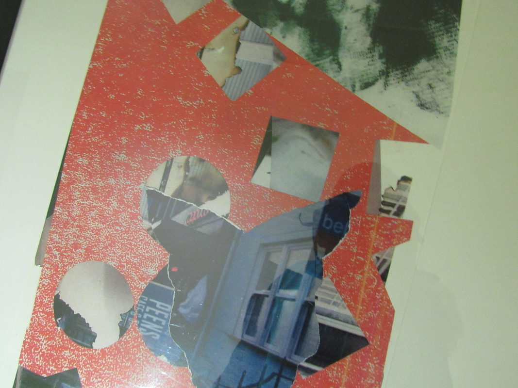
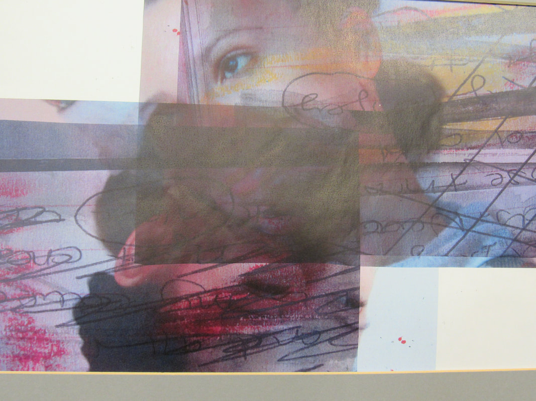
For my personal project I made a collage with primary colours. I got the idea from Piet Mondrian abstract painting. To make some of the pictures stand out I cut out borders in primary colours around the pictures, this makes the collage more interesting and colourful. I cut the photos into different sizes and overlapped them into different positions. I stuck down the pictures horizontally.
The positives to my project were that I managed to stick to my theme of my project and my plan which was to have a collage inspired by Piet Mondrian. I I also liked how
If I was to do this project again I would improve it by having more brighter colours or maybe I could have photoshopped some of the photos.